Summary
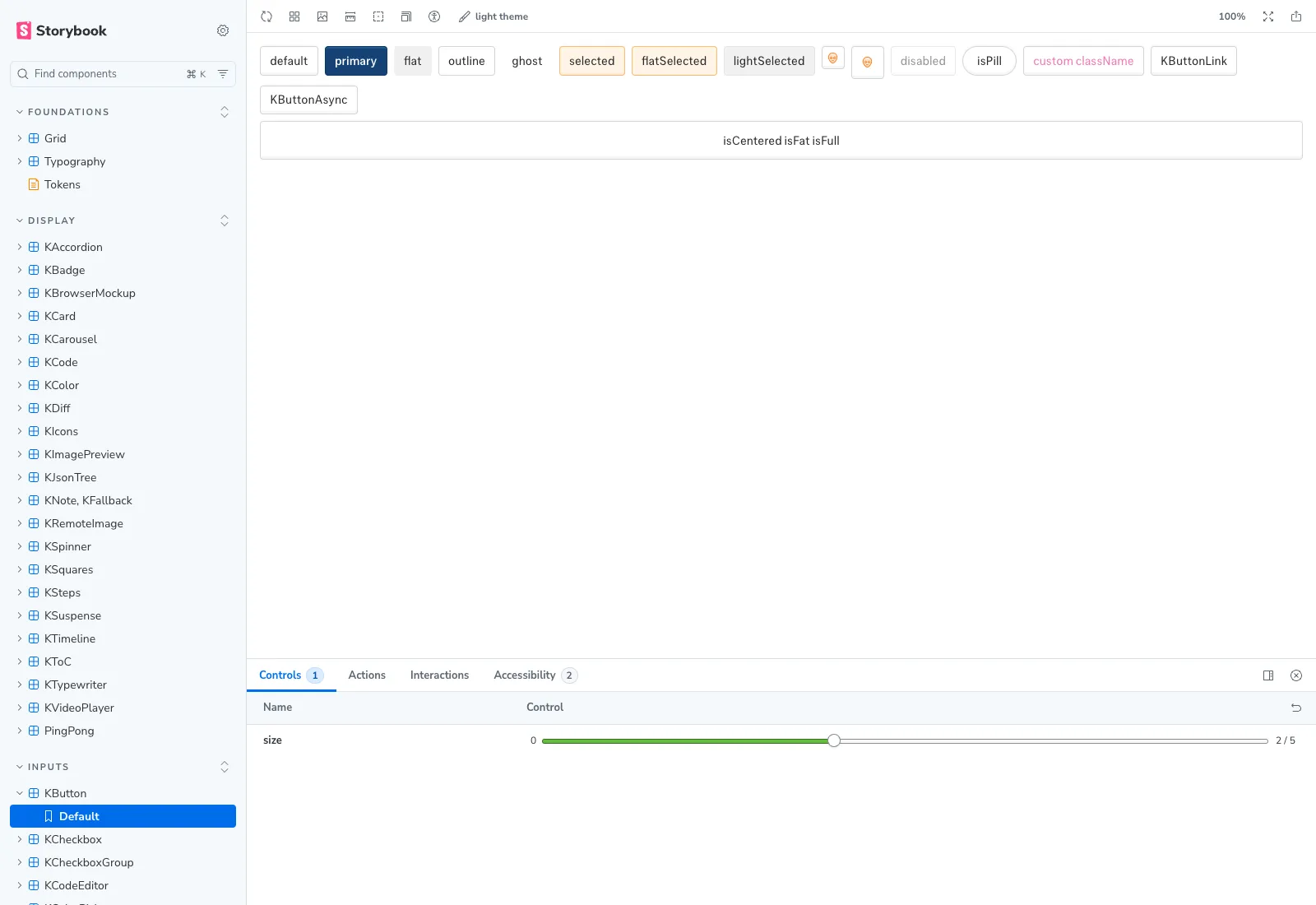 The system in the browser — sidebar grouped by responsibility, KButton rendering every look + state, controls exposing the canonical
 size prop.
Business Case
Same AI platform I rebuilt the setup wizard for in /work/web-scraping-platform. Different problem this time.
Ten backend engineers. One designer-frontend (me). Velocity wasn’t a backend problem — engineers know how to build. It was a design problem. Every new feature meant another spacing decision, another button variant, another check-in with me before something could ship. I was the bottleneck.
The scale unlock wasn’t more designers. It was codifying the design system so engineers could build on-brand without me. A documented contract — tokens, primitives, governance — turns “is this on-brand?” from a question I have to answer into a check engineers can run themselves. The system doesn’t lock design down to ship faster. It lets ten people ship from the same source of truth.
Sixty-plus React components had grown organically across two years. Spacing drifted. Naming drifted. Contracts drifted. New features kept rebuilding primitives because finding the existing ones was harder than copying them. There was no Storybook. No tokens. No documentation. Just a kui/ directory that worked, mostly, and a globals.css file holding the only real source of truth for color and type.
The ops team had Activity Log queued — filter agent runs by workflow, status, date range; preview payloads; export for compliance. Building it on the existing pile would have meant another round of copy-paste primitives. The cheaper move was to codify first, then build Activity Log as the system’s first real consumer.
Storybook: 52 stories, dark mode, a11y addon, Foundations/Tokens MDX page.
My Role
Sole architect and committer on the system itself — token extraction, Storybook setup, the audit pass, the Activity Log composition, and the later extension pattern. Two other frontend engineers shipped product features against the system once it stabilized; the governance contract was mine to hold.
- Audit: catalog 60+ components by responsibility (general / display / interactive / inputs).
- Atomize: extract the design contract from
globals.css— typography scale, color ramps, breakpoints, motion canon. - Codify: Storybook 10 +
@storybook/nextjs-vite, 52 stories, aFoundations/TokensMDX page. - Consume: compose the Activity Log dashboard from existing primitives.
- Extend: later — design and ship the Conditional Date Filters pattern as composition, not invention.
Part 1 — From scratch: codifying the atoms
The system as I found it
Sixty-plus components in kui/, each a working React module, none documented. Some exposed size as sm | md | lg. Others used small | medium | large. A KButton had eight look variants and six sizes; nothing said which combinations were sanctioned. A KBadge existed in three near-identical implementations across three feature folders.
The globals.css file held the real tokens — Tailwind 4 @theme blocks for color, typography, radius, shadow — but nothing referenced them by name in design conversation. Drift was the default.
Audit, atomize, codify
Three moves, in order.
Audit. I cataloged every component in kui/ by responsibility: general (KCard, KSurface), display (KBadge, KTable, KTimeline, KCode), interactive (KButton, KSelect, KModal), inputs (KInput, KDatePicker, KDateRangePicker). The grouping became app/data.js — a single catalog file the rest of the system reads from.
Before After───────────────────────────── ───────────────────────────────────kui/ Foundations├── KAccordion.jsx ├── Grid├── KBadge.jsx ├── Typography├── KBarChart.jsx └── Tokens (MDX, sourced from globals.css)├── KBrowserMockup.jsx Display├── KButton/ ├── KAccordion · KBadge · KCard · KCarousel│ ├── KButton.jsx ├── KCode · KColor · KDiff · KIcons│ ├── KButtonAsync.jsx ├── KImagePreview · KJsonTree · KNote│ ├── KButtonDanger.jsx ├── KSpinner · KSquares · KSteps│ └── Link.jsx ├── KTimeline · KToC · KTypewriter├── KCalendar.jsx └── KVideoPlayer · PingPong├── KCard.jsx Interactive├── KCardContent.jsx ├── KDialog · KMenu · KMovable├── KCardFooter.jsx ├── KPopover · KScrollToTop├── KCardHeader.jsx ├── KTable · KTabs · KToaster├── KCardLink.jsx └── KTooltip├── ... 90+ more files Inputs└── (no docs, no Storybook, ├── KButton · KCheckbox · KCheckboxGroup no token contract, ├── KCodeEditor · KColorPicker · KCopyButton no grouping) ├── KDateInput · KDatePicker · KEditable ├── KEmail · KInput · KPassword ├── KRadioGroup · KSelect · KSlider ├── KTabularInput · KTextarea · KWords └── (each: 1 story, size control, a11y panel)113 files in kui/ collapsed into 4 sidebar groups + 52 named stories. The grouping isn’t decoration — it’s the contract a contributor reads before adding component #61.
Atomize. I extracted the design contract from globals.css into a named token map — --color-fg-primary, --space-2, --radius-md, --motion-fast — and audited every component for token references vs. magic numbers. The magic numbers got replaced. The 100ms motion canon (used everywhere from button hover to modal entrance) became a documented --motion-fast rather than a hardcoded transition-duration: 100ms repeated across forty-three files.
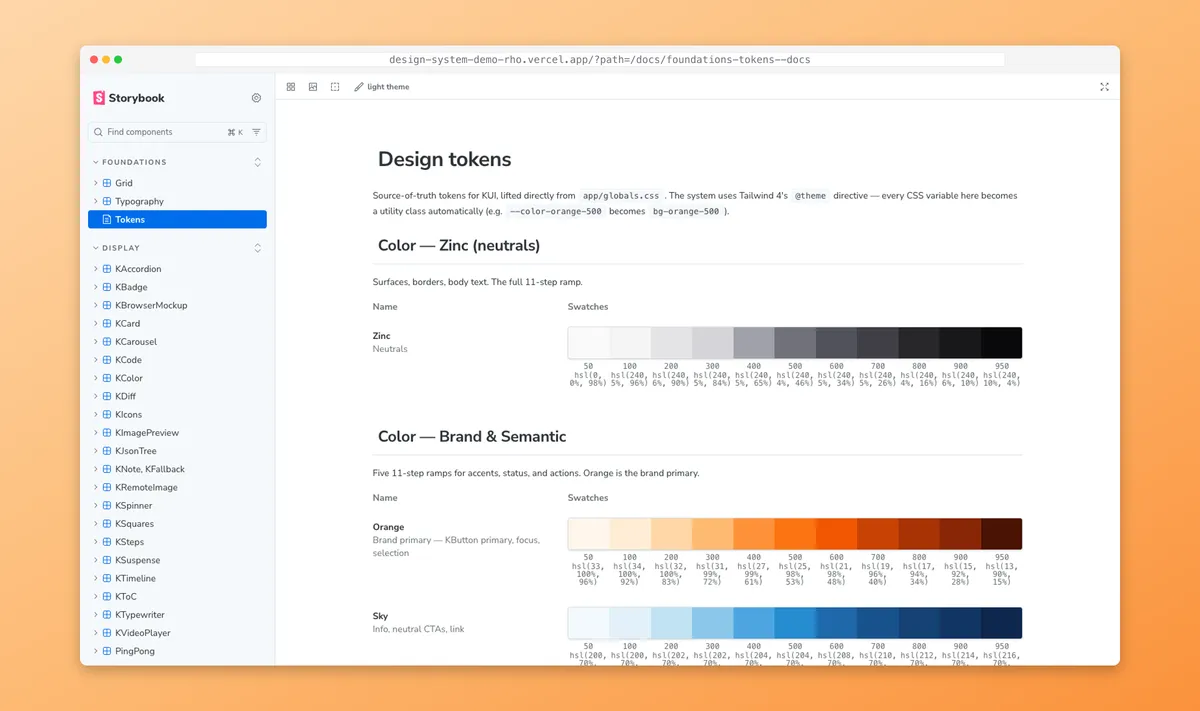
Codify. Storybook 10 with @storybook/nextjs-vite — the framework combination that integrates cleanly with Tailwind 4 + Next.js 16 (the alternative Webpack-based @storybook/nextjs requires extra build wiring on Tailwind 4). I imported Tailwind directly in .storybook/preview.css because Vite drops nested @imports in globals.css — a documented community gotcha. Stories were generated from the existing public/kui-snippets/*Demo.jsx files via a small script: 52 stories, one per component, with size as the canonical control. The Foundations/Tokens page is an MDX doc that reads tokens from the same source globals.css — a single edit propagates to docs, stories, and runtime simultaneously.
Foundations/Tokens MDX docs page — sourced live from globals.css. Zinc neutrals, Orange brand primary, Sky for info CTAs, Green for confirmations.
The system didn’t grow new components. It grew a contract over the existing ones.
First consumer: Activity Log
The Activity Log brief was concrete. The ops team needed a dashboard that tracked every action across a team — workflow runs, configuration changes, user actions, notifications. Filter by workflow, user, date range, or event type. Export to CSV for audit-ready reports.
I composed it from five existing primitives.
Activity Log in motion — filter, sort, drill into events. Built entirely by composing existing primitives.
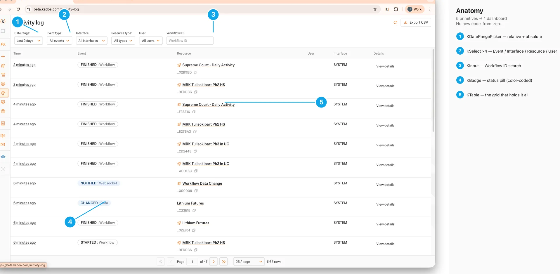 Five primitive types — KDateRangePicker, KSelect, KInput, KBadge, KTable — composing one Activity Log dashboard. No new components.
KTable for the event rows. KBadge for status (FINISHED, RUNNING, FAILED, CHANGED). KSelect ×4 for the filter bar (event type, interface, resource type, user). KDateRangePicker for the date range. KInput for the workflow ID search. The “View details” drawer reused KModal and the existing payload viewer.
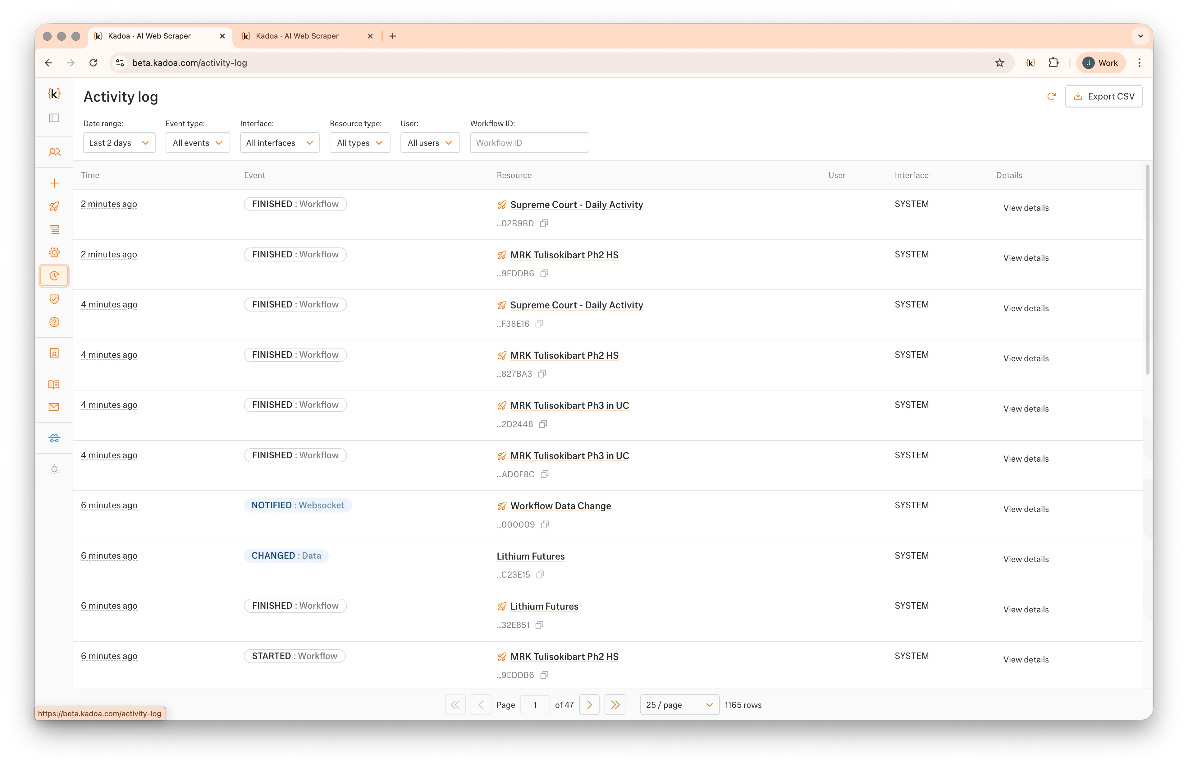 Activity Log: filter bar, status badges, resource IDs, paginator. Every visible element is a primitive already in the system.
 Column anatomy — Time, Event, Resource, User, Interface, Details. The grid has four hard columns + a freeform Details affordance per row.
Composition over creation. Not a slogan — a budget. Building Activity Log as five composed primitives instead of a bespoke dashboard cost roughly a third of the time the previous “build a new thing” approach would have, and it surfaced the system’s first real stress test under load.
What shipping AL revealed
Shipping the Activity Log surfaced gaps the audit hadn’t. KTimeline didn’t have a dense variant suitable for high-frequency events; I added one. KCode lacked syntax tokens for JSON payloads; the existing color ramp covered it once I named the tokens properly. The pagination control was duplicated in two places — different implementations of the same idea — and got consolidated.
Governance debt got logged for v2: a contribution doc, a deprecation policy for the old pagination, and a token-sync infrastructure question (Style Dictionary) parked for later. No token sync infra — yet. The tokens live in one file; that’s enough until two consumers need them in different runtimes.
The system gained a stress test and a list of next-priority gaps. That’s what a first consumer is for.
Part 2 — Extending: a new pattern earns its place
The brief
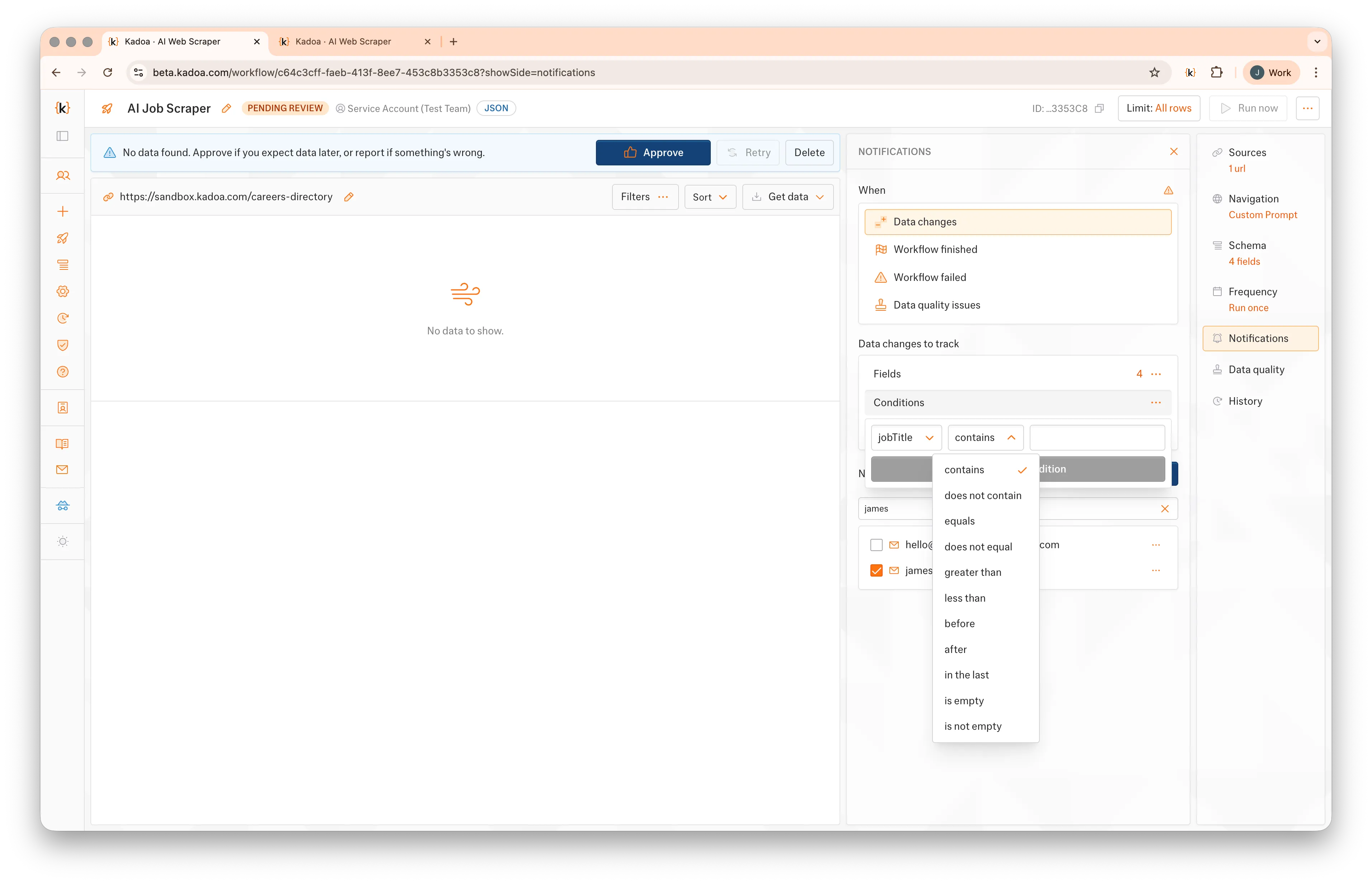
Three weeks after the system stabilized, the notifications feature needed a new semantic. Rules already supported “before date X” and “after date X” — both absolute. Customers monitoring contract expirations, deadline tracking, or rolling windows kept asking for the relative version: trigger the notification when data changes occurred in the last seven days.
KDatePicker is absolute. The new requirement is relative. No existing primitive composed into it cleanly. The system’s first real test: could it grow without bending?
The decision: composition over creation
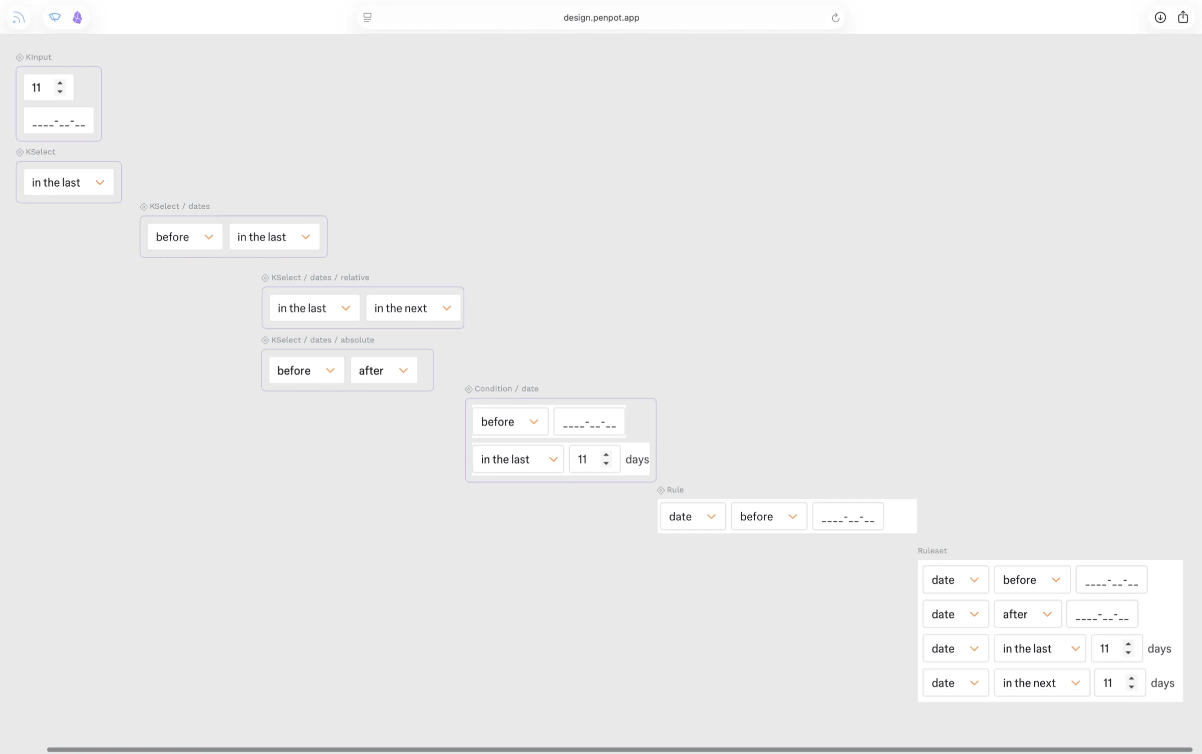
A new pattern, not a new component. Three existing primitives wired through one controlled state object:
KSelectfor the operator (before,after,in the last)KInputfor the quantity (1)KSelectfor the unit — minutes, hours, days, weeks, months
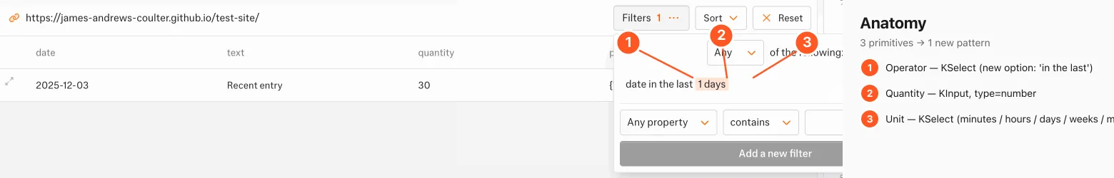 Three atoms — KSelect (operator) + KInput (quantity) + KSelect (unit) — composing the “in the last X” pattern. One new variant added to KSelect for the unit menu; no new component invented.
The only addition to the system was a new compact variant on KSelect for the unit menu — narrower, tighter padding, designed to sit flush against an inline numeric input. That variant landed as a single PR in the existing component, with a story added to KSelect.stories.tsx. The rest of the pattern is composition.
The state is one object: { operator: 'in_the_last' | 'before' | 'after', quantity?: number, unit?: 'days' | 'weeks' | 'months', date?: Date }. The component switches its inner layout on operator. Operator picker stays mounted. Mental model preserved: it’s still a date filter, just a relative one.
Anatomy and motion
 The operator dropdown — the entry point that switches the row from absolute to relative.
Operator change → quantity input + unit picker fade in at the canonical 100ms. Same motion token as every other state change in the system.
Library parity in design tooling
The same atoms live in Penpot. Atomic → composed hierarchy mirrors kui/; the operator vocabulary the React component exposes is the same vocabulary a designer composes with through Swap Component. One contract, two surfaces.
 Penpot library mirroring
 kui/. Atoms (KInput, KSelect) top-left; composed (Condition/date, Rule, Ruleset) bottom-right — the React component tree, in design-tool form.
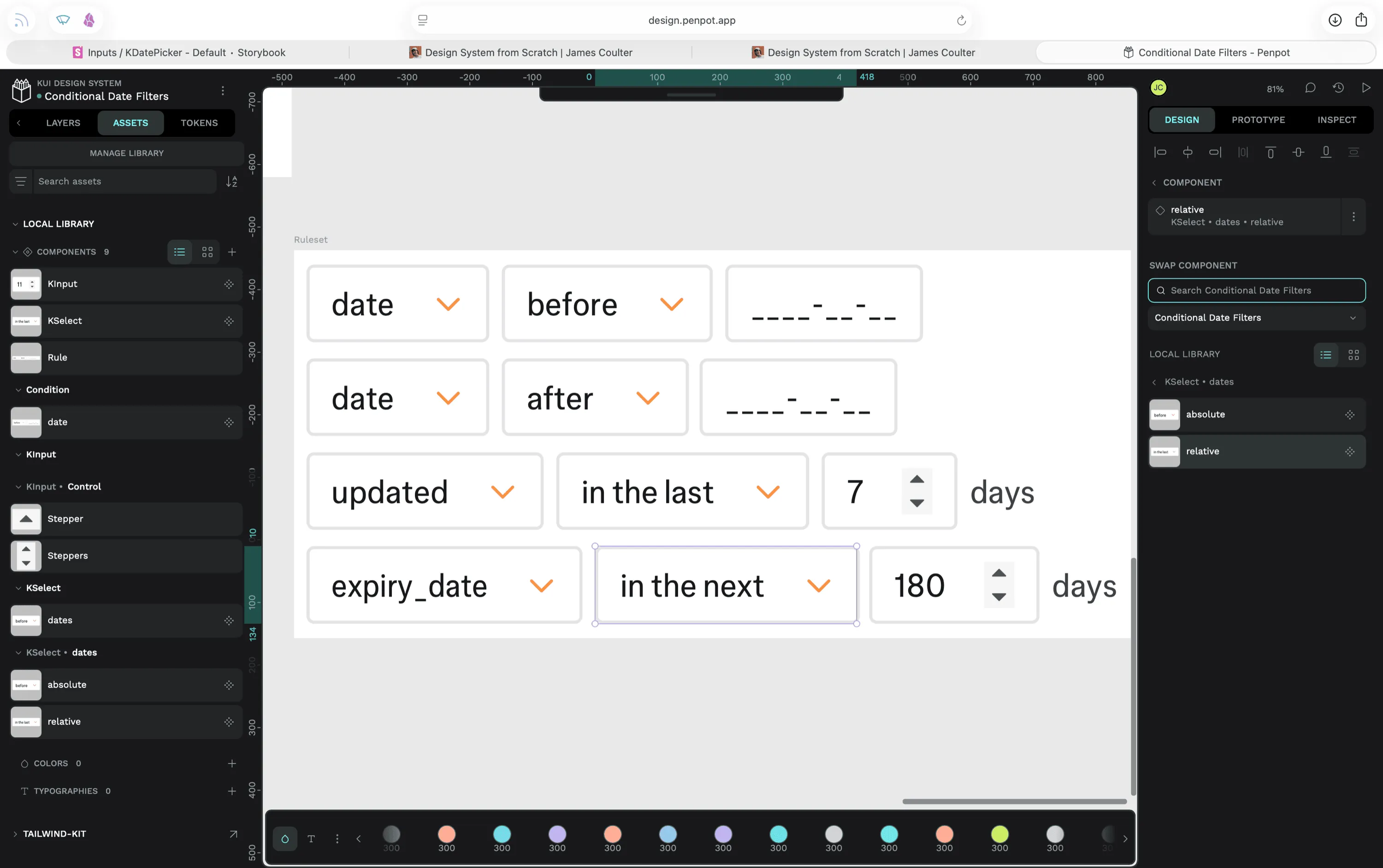 Composing a Ruleset in Penpot — same operators, same units, same variants as the React contract. Swap Component (right panel) toggles
 relative ↔ absolute exactly the way the React component switches inner layout on operator state.
Live composition in Penpot — variants swap, operators change, rules drop in. Designers reach for the same atoms engineers do.
Adoption
Within a week, the pattern got adopted twice more — once by the Activity Log’s date filter (the same dashboard from Part 1, retrofitted), once by quota alerts. The system grew; the atoms didn’t move. The pattern earned a Storybook story so the next engineer doesn’t reinvent it.
That’s the test. The atoms hold. The pattern is documented. New surface area is composition, not invention.
What this proved about the system
A documented system with a governance contract grows by composition. A pile of components grows by reinvention. The difference isn’t visible on day one — it’s visible on day twenty-one, when someone asks for “in the last X” and the answer is three primitives plus one variant rather than a new component, a new contract, and a new round of drift.
That’s the start of a design system. The next layers — full a11y audit (focus order, ARIA on KModal/KSelect, contrast tokens beyond AA), Figma library parity with kui/, Style Dictionary token sync, contribution and deprecation policies — are documented in the v2 backlog. The MVP shipped because it had a real consumer driving it. The v2 work needs the same shape: a real consumer, a real test, a measurable gap.
Retrospective
- Code-first design systems reveal what design-tool-first systems hide. Atomizing from
globals.cssexposed the magic numbers, the duplicated pagination, the missing motion token. A Figma-first audit would have caught the visual drift; a code-first audit caught the contract drift, which is the more expensive kind. - A system earns the right to grow by being used first. Activity Log was the real test of the codification work. Without a first consumer, the audit would have stayed an opinion. With one, the gaps surfaced and the next-priority list wrote itself.
- Composition is the cheapest path to “new” — and the most honest. The Conditional Date Filters pattern shipped in a fraction of the time a bespoke component would have, and it left the atoms intact. When a system is good, “new” should mostly mean “newly arranged.”
Related case study: /work/web-scraping-platform